Pages


Saturday, April 30, 2011

CiM Rainforest

 Creation is Messy came out with 4 new colors and I got 3 of them.  I tried out Atlantis last week and this week's Rainforest, a dark teal opal.  The rods reminded me of CiM Mermaid and Effetre grass green opalino.  I imagine it is also similar to petroleum green, but don't have any.
 It isn't hard to see why it reminded me of Mermaid.  I thought it would be basically an opal version of that, but a look at the rods, specifically the rod ends, shows that they are both teal but that's all they have in common.
 Effetre grass green opalino seemed closer, but the rainforest retains more of its translucency when annealed.  Note how the opalino on the rainforest shows up much clearer than the rainforest on the opalino.
 The plain spacer is so small it didn't really lighten up any, and this is a dark color.  Wrapped in silver, reduced and encased, you can still see the mandrel under the light glare and my fingerprint.  I didn't get much reaction from the reduction and there is a reason for that.
 It's really hard to reduce things on this glass.  Both these beads are made with DH Triton.  Note how it only reduced on the edges.  I had a fresh tank of gas and had it turned up all the way to do these, and only reduced the edges of the Triton, and that only without encasement.  As soon as I put another glass on top, away the metallic bit went.
This one would be easier to describe if I hadn't put one of the beads on the mandrel backward.  From the space between the beads is CiM Tuxedo, copper green, EDP, opal yellow, ivory, and CiM Peace.  Black is barely visible on top of Rainforest and Rainforest is invisible on black.  I love what's happening with the copper green.  Must do a bead like this.  Nothing ugly with EDP, but not doing much either.  Opal yellow looks neat with it, but I don't care for what I can see with the ivory.  Peace looks pretty ethereal with it, and I wonder what would have happened if I did layers and encased it.

I want to try this out with copper green and peace (perhaps not in the same bead, but hmmm...) and I think this will be good to use on its own.  Like Atlantis it is a very rich, juicy color, but what I'm hoping for is this shade in an opaque....

Friday, April 29, 2011

Spring Willow Revisited

 Here are a few of the beads with Effetre Spring Willow.  The blush looks a lot better now than it did going into the annealer.  Kiln striking?  Don't know, but I like it.   I threw in a few spacers of Effetre Sedona to highlight the colors, and I do like the combination.  Both glasses are very variable and I think they work well together.
 My leaf....  Quite a bit of drooping going on in the annealer, and that bubble on the right side wasn't there going in.  Rats.  I'll just say it adds to the organic feel of the bead.
On the back in the protected, unstruck part beneath the mandrel, is the color the rods and beads start out.  Now it is easy to see why I thought this might act like Effetre copper green.  When I feel better I'm going to play with this some more.

Thursday, April 28, 2011

Patience is a Virtue


Patience may be a virtue, but I'm not at all virtuous some days.  I'm listening to the annealer relays click and wishing it would get on with it.  I made some more beads with the spring willow I blogged about yesterday and I can't wait to see what happened.  Like all cases of infatuation, there is that initial glow and the inevitable disillusionment.

Today's disillusionment came when I changed the tank on my MAPP gas.  The flame is hotter and voila, not only is spring willow soupy but it boils.  Badly.  Ever so much worse than ivory.  I've never seen huge bubbles form within the rod as I'm heating it.  Must see what it does with intense black and Hades.  Usually when I get an air bubble in a bead I heat it more to get it thin, let it cool a little and pop it with my probe.  These puppies just keep reforming.  It also seems to scum up quite a bit the way turquoise does.  Don't know what will come out of the Chillipepper....

The first bead sagged so much while I was trying to get a bubble out that I finally decided to go with it and let it sag all the way, pressed it in my leaf masher and drew it out to a point.  It didn't seem to strike as beautifully today either.  Probably needs to be done at a lower temperature.  Assuming the beads anneal at some point I'll throw in some pictures.

The apartment is about 90 degrees with the heat wave we've been having and the torch and kiln on.  Dinner tonight may very well be leftovers.  I don't know, though.  I don't get home until 11 tomorrow and have to be at work at 5:30 on Saturday so I'm not loving the idea of cooking tomorrow night.
Until I have pictures of the beads I made today, here are some that feel right for the weather.

Wednesday, April 27, 2011

Effetre Spring Willow

 I ordered this color with intense reservations, remembering my experience with Effetre mint green, which for me was just a variation of their copper green that didn't do anything special for me.  The picture on Frantz' web site looked very similar.  A little more yellow perhaps, with some streakiness.  As soon as I started heating it I knew this was not the case.  It went transparent the way the ivory shaded odd lots from Vetrofond did.
 The top bead is perhaps the worst lentil I've ever made.  Ignore the shaping and it is with silver melted in and reduced and encased in Effetre super clear.  This glass stays very soupy, and droops in the kiln a bit if it isn't set well going in.  It also strikes to the most delicate pink, which looks phenomenal with the pale green.  Melted in silver doesn't improve it, but that's OK, I like it just the way it is!
 Because it melted like Vetrofond biscotti, I tried it out with DH Triton.  I didn't get much reduction (my fault, not the glass) but the fuming is gorgeous.  Have a close up.  It's almost like another glass.
I didn't actually test this on ivory and I wish I had, but here it is with other colors.  It looks good with CiM tuxedo on the left on both beads.  The top bead has a core of spring willow and the bottom one is with other colored base glass.  Next up on the top bead is copper green, which gets lost.  Copper green is the middle right band on the bottom bead, and other than the spreading, nothing dramatic, so spring willow isn't an ivory.  Opal yellow is on the right end on the top bead and middle left on the bottom.  It so gets lost under the spring willow, both as stringer and as a base.  Peace was the last test color and it holds up a bit better than the opal yellow but bleeds a lot.

I like this glass and I'm thinking 1/4 lb. isn't going to last too long.  I want to do some plain beads just with spring willow to explore that blushing thing, and you can bet I'm going to see what it does with Psyche and a larger bead with Triton, probably doing a set for myself.

Tuesday, April 26, 2011

Onto other stuff

Sefko, I'm sorry I missed you.  Have a safe trip and enjoy your family.  When you're ready, so's your necklace.

What has this to do with what else I've been working on?  Absolutely nothing.  I'm sick of trying to figure out why what is supposed to be Effetre dark periwinkle is having compatiblility issues with everything I put it on, all of a sudden.  It is probably something different, but I have no idea what, as I only use COE 104.  CiM grumpy bear and Effetre light periwinkle split too and I'm sick of fooling around with it.  As far as I'm concerned, I somehow managed to get a weird stringer and the rest has already been thrown out.
 This is a cool thing I've been able to get Effetre dark silver plum shards to do.  I wrapped a bead of Effetre Sedona with shards of silver plum and super heated them.  I got lace.  Cool.  The silver plum stayed plum, which is cool, but I couldn't get Sedona to do its tricks.  Still cool.  The slip is showing on these beads, because I couldn't bear to waste glass making a whole bead out of Sedona.  Now I'm going to have to see if it does it on other colors.  I had some CiM cirrus on the bench and tried it there but it didn't lace and it went metallic.  EDP would be a waste of time, since EDP and Sedona act very similar.  Maybe a green or blue.

Sunday, April 24, 2011

Green and Periwinkle

 On Friday I posted an unforseen reaction I found when trying out one of my favorite color combinations.  I had hoped that the problem was with CiM peacock green, which I love but can work around.  Apparently, it is with the combination of this blue green and Effetre periwinkle.
 This was the first bead, made on a base of peacock green with cracks surrounding the periwinkle lines.
 Since peacock green is relatively demanding with regards to annealing, I hoped that switching the glass and being careful with the annealing would yield better results.  The result on Effetre nile green opalino belies this.  I was extra slow annealing in my Chilli Pepper just to be on the safe side.  There are still cracks all around the Effetre dark periwinkle  scrolls.  If I didn't melt the periwinkle in, nothing bad happened, but apparently there is some stress from the glass itself so I don't expect the bumpy one I did will hold up long.  I've used this periwinkle on other beads with other bases so it's just the blue greens that are a problem.
I made a small, spacer sized, bead with peacock green and CiM grumpy bear melted in to see if it would react the same way.  I am thrilled to say it did not.  Note the separation in the middle of the periwinkle lines is opposite what's happening with the Effetre periwinkle.  It looks like the bead might be cracked, but what is happening is light reflecting on the bottom of the sunken in scrolls.

I think for kicks I'm going to do a bead of grumpy bear with Effetre dark periwinkle decoration and see what happens.  This is driving me nuts.

Friday, April 22, 2011

Now that's bizarre!

 This is a reaction I never would have thought to test for.  The glasses involved are CiM's beautiful peacock green and Effetre dark periwinkle.  The bead worked normally and went into the annealer just off red hot.  As the annealing cycle wore on, I began hearing the dread clink at around 600 degrees F.  I allowed the beads to cool, then removed them to discover this.  I did make a solid peacock green bead this size that did fine, so I can only assume that there is a slight incompatibility between the green and the periwinkle.  Check out the neat separation thing going on on the surface of the periwinkle.
 Kind of bizarre the way the  periwinkle sort of formed a clear bubble around itself that is reflecting itself onto the peacock green.  It seems to be sinkin in too.
 Tiny hairline cracks formed all around where the periwinkle was applied.
The cracks around the periwinkle really show up well in this picture, even though it's out of focus.  I couldn't get the camera to focus properly in this shot, but it shows the ruin better than any of the others.  What a bummer.  I would have liked this color combination.  I did something similar with Effetre nile green opalino that is holding up so far, so that will have to be the green and violet blue I was looking for in this piece.  Anyone have a similar experience?

Happy Earth Day!

Thursday, April 21, 2011

Honeysuckle?

Pantone's color of 2011 is 18-2120, called (by them) honeysuckle.  To see a more accurate portrayal of this color, check out this link from Pantone's color and design page.

How would you get this in glass?  The only thought I have is to layer a dark pink like CiM cranberry over a light color, such as a very pale yellow.  Maybe it's best to use the honeysuckle in other elements of the jewelry design and stick to coordinating stuff for the glass.

Is there a type of honeysuckle that is this color?  The kind that grew wild where I grew up was white to start out with and yellowed out as the flowers aged.  Maybe the kind that is sold in nurseries or grows in a different part of the world is a different color.  Sort of like daisies.  I lived my entire life thinking that the only types of daisies were Shasta or Mantauk (I know I spelled that wrong), Gerbera or African.  All of them are compound flowers with large oval-ish petals surrounding a central hub.  Think of those white and yellow flowers from the old show "Please Don't Eat the Daisies."  Turns out there are English daisies that don't look anything like their American namesakes.  They are uniformly tufted with more slender, pointed petals that start out white at the base and turn dark pink at the ends.

So how do I plan to translate this color into glass?  I don't.  I plan to make what I like and let this trend slide past.  It is, after all only the color for one year.  Maybe next year they'll pick a shade of green.  I am almost certain to have it.

Tuesday, April 19, 2011

CiM Atlantis

 I finally got a chance to replenish some of my glass, and CiM's yummy Atlantis was a new color.  It's a bit of a cross between Mermaid and Ming, and a bit of an opal, though it isn't really evident if it's not layered over anything.  Like all the CiM colors I've tried so far it has been easy to work, without boiling, oozing or being all shocky.
 These odd beads are, from left to right, self spacer, encased with Effetre clear 006, over clear a little too thickly to see how translucent it is, with reduced silver foil badly encased in clear as my tank ran out, and the same bead badly reduced but properly encased.  The glass gets a little lighter on the ends, as visible on the plain bead.  I'm not sure whether working it longer or hotter makes it lighter or darker.  I think the lightening is like the devitrification you see on EDP, but it isn't devitrification because it remains glossy.  Cool fade effect, though.  I would like to blow some shards of this to get a nice thin layer of encasement on clear to get a better translucency.  I acutally like the enencased portions of the bead I reduced with silver foil better, but I'm not sure what kind of bead I'd use it in.  I'll probably like this better for it's clear color.
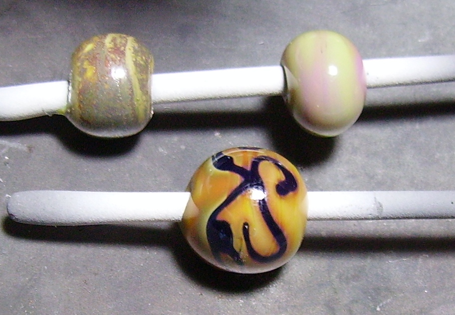
 CiM Peace separates when applied on top of Atlantis, and Atlantis spreads pretty dramatically on top of Peace.  The separation of the white was still there but not as dramatic when I did this with Effetre white, probably because Peace is very slightly translucent.  On the top row is a bead with a thin shard of silvered ivory melted all the way in but too small to see anything.  The next is Atlantis with EDP dots.  Nice edge and little reaction.  The black spots on the EDP are where I overheated it and burned it.  Not the glass' fault.  On the right is with DH 331 test batch, a sort of Terra light, and I failed to get much color.  Not a surprise considering my skill with striking DH glasses, really.
 I wasn't impressed with what happened when I combined Atlantis with ivory.  On the left I superheated things a bit to get the maximum reaction, and got it.  The effect I got with the barely melted shard of silvered ivory was much more pleasant.
 Opal yellow lightened a lot when I used it with Atlantis, and I like the absence of a reaction.  If I wanted an ivory look I'd use the opal yellow.  Some separation here as well, but tis cool.  I'm digging the bead with CiM Tux and Atlantis.  The blue is still visible but only just on top of the black, which is very neat.
 This one didn't reduce well, or reproduce either for that matter, but it's with DH Triton, on the left unencased and encased on the right.  The reduction effect is actually visible on the bead, but I would have liked more drama.  It is my fault, not the glass.
This one surprised me.  Who knew copper green would do this?  It's like the copper green was trying to sink into the Atlantis but getting stuck on the edges.  And the dark rim in the middle of the copper green waves and dots is just weird.  I wonder if it's some sort of reduction on the copper green and if soaking the bead in lime scale remover would help?  It's as if there's another color running down the middle of each copper green spot.  Not when the Atlantis is on top, though.  That just spreads out all over the place.  I wish I'd studied more in chemistry.  This is so neat and I have no idea why it does what it does.

I love this color.  It's so pretty on its own I may not combine it with anything else but I'm glad I paired it with stuff ahead of time so I don't use up a whole lot on something that's not going to work the way I think it should.  Maybe I should get a little more now.  I tried to order some CiM Appletini and it was already sold out, and this is sure to go that way soon if they don't make more.  I hope they make more of both.

Monday, April 18, 2011

It's a Day

I did work on the torch yesterday, but nothing was worth taking a picture of.  There are days like that.  So I'll muse instead.  Feel free to ignore my rambling on.

The new year is now over 3 months gone and how am I doing on my unofficial New Year's Resolution?  Not perfectly.  Have I benefited?  Somewhat.  Did making a resolution make a difference?  I don't know, since I didn't actually resolve anything specific.  Does making a resolution matter?  What purpose does resolving serve on New Year's Eve or any other day?

I resolved unofficially to do better in 2011.  Not anything specific, since I've had plenty of practice with weight loss and other resolutions.  I have done better.  I lost a ton of weight last year and even managed to lose 15 more pounds or so this year.  The past 2 weeks haven't been a good example but I've been hitting the gymn and am quite a bit fitter.  The house is reasonably dirty rather than extravagantly.  I've been minimizing TV time.  I have felt generally better. 

The fact that I didn't make an actual resolution makes it easier to keep.  If I had, say, resolved to lose 20 lbs. and vacuum twice a week and work out 5 times a week I would have failed, giving me the excuse to abandon the effort.  This way, I can say I've made progress and continue to try. 

New Year's resolutions are notoriously hard to keep, and are nonetheless important.  They reflect a desire to be a better person.

Sunday, April 17, 2011

Shards

Readers of the Dragonflight series will remember that "shards" was an oath and I did my share of swearing when trying to achieve this technique.  I started with a 1/4" OD stainless tube and made a bubble of glass on the end, heated it to cherry hot then blew into the cool end of the tube, blowing tissue thin shards of glass all over the table.  A little too much pressure.  I then applied much less pressure and produced the very thick, unusable bubbles shown.  After much experimentation I finally figured out my problem:  I was trying to heat evenly and was not able to see what I was doing.  Perhaps looking down the tube at the end of the bubble wasn't the right way to go about this.  If only I could look sideways and blow at the same time.  I needed some flexible tubing, which I obtained.  No real success, since to heat the glass evenly it must be rotated and it is almost impossible to rotate the mandrel with 3 feet of flexible tubing hanging off one end.  Off came the tubing and enlightenment dawned.  Heat the bubble evenly while holding the mandrel sideways, then blow gently in the end out of the flame.  Cue the heavenly music.  The completed bubble is about the size of a duck egg and did shatter when I cut it off the end of the mandrel.  Oh well, 3/4 of an egg is better than none at all.

Saturday, April 16, 2011

After a (not so short) break...

 Yeah, it's been a very long time.  I haven't been entirely away from my torch but I haven't been at it as much as I'd like.  The above set is the result of a couple weeks of doing a couple beads here and there.  The base glass for this is Creation is Messy's Canyon de Chelly, one of my absolute favorite glasses to use.  Not only does it play nice in the flame, but it does some pretty cool stuff with other colors and techniques.  It is a striking color that changes color depending on whether it's just heated and cooled or heated, cooled, and reheated.  And then there's the size of the base bead, which makes a difference.  It's easier to get it to do the neat stripey thing on a large bead than a small one.  Shaping the bead with metal seems to give better effects, so the rapid cooling and partial reheating is key, and sometimes after the color strikes it unstrikes again, but unpredictably.  It doesn't seem to change color in the annealer, which I really dig.  What you see going into the annealer is what you're going to get.

The earrings on the right were my first stab and combining CDC with Double Helix Psyche.  I don't know how evident it is in the picture but there is a reaction on the CDC where the silver laden Psyche touches it that doesn't occur with DH Triton or silvered ivory.  I call that neat.  The central beads contain only CDC and Psyche.  The border on the dark Psyche is the reaction from the CDC.  It has to be melted in and superheated.  Notice in the top photo and the vessel that it doesn't always do this.
With this bracelet I was going for balance and similarity between the glass and the dyed freshwater pearls  I used in the earrings, since the pearls were too small for the bracelet.  The glass I used on the spacers is Vetrofond plum.  It does this neat metallic thing similar to Effetre silver plum when treated the same way, that is allowed to air cool until the glow is gone and reheated gently in the top of my hot head flame, but stays more purple, so call it light silver plum.  Note the beads three beads in from the clasp.  The base glass is yellower because it didn't strike at all, being CiM Stoneground.  I couldn't remember whether I used Stoneground or CDC on the earrings and the lack of reaction on these beads reminded me.  Hey, this bracelet is for my own use and with the weight on the clasp it stays right side up so no one will see them anyway.
 I had so much fun making this vessel I'm keeping the pictures big and showing both sides, so there.  I used a 3/16 mandrel and built the end on the end of the mandrel again so it was a pain to clean, but with a solid color vessel and not planning to sell this I went for the stability of having two base beads to build from.  This meant I had two ends to keep warm but for every flower a tear.  I didn't melt the Psyche in all the way but I was loving the way the CDC was striking and I wanted to leave it the way it was.  I also hate the way the camera washes out the reduction effect of the Psyche, but trust me, it really is there.  The handles and rim are made from an actual rod of Effetre Lace Agate I have been hoarding.  On the smaller beads I used silvered ivory, but it wouldn't do for functional handles, since I can't really pull stringers that thick.
I have missed working glass.  There have been compensations, like losing 50 pounds through diet and time at the gymn.  I hope to continue losing about 20 pounds to get back to my "feel good" weight, but the signs of diabetes that scared me, the blood clot that sidelined me and the limitations that my excess weight caused on my mobility are gone.  I recently acheived a time on a mile "jogging" (more of a fast walk, really) that I haven't achieved since I was 15.  Now I have to try to incorporate the things that I really like doing with the things that I need to stay healthy.  I'll never achieve perfection, but all I ask for is a fighting go.  I may even post a new profile picture if I can find someone who knows how to work my camera.